The Challenge
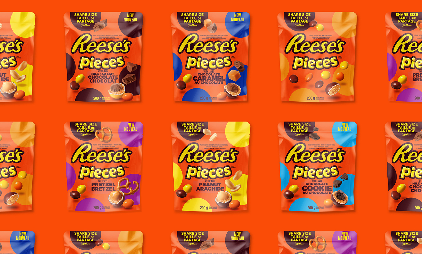
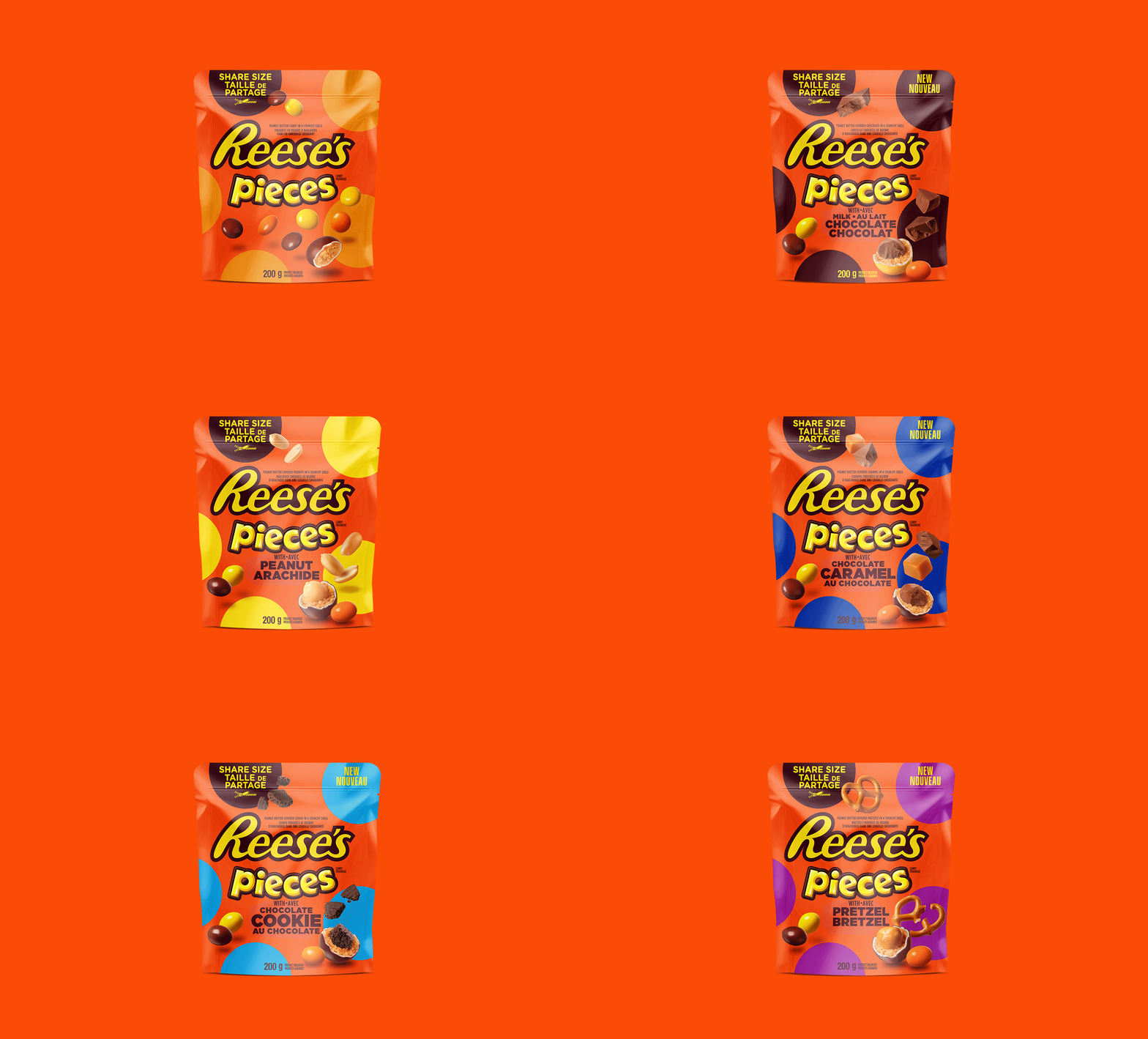
We were tasked with leveraging Reese’s iconic brand assets into the Reese’s Pieces portfolio while also seeking to establish a cohesive design architecture that allows for flexibility with future launches. At the same time, we had to elevate appetite appeal, create energy, and ensure variety differentiation.
The Solution
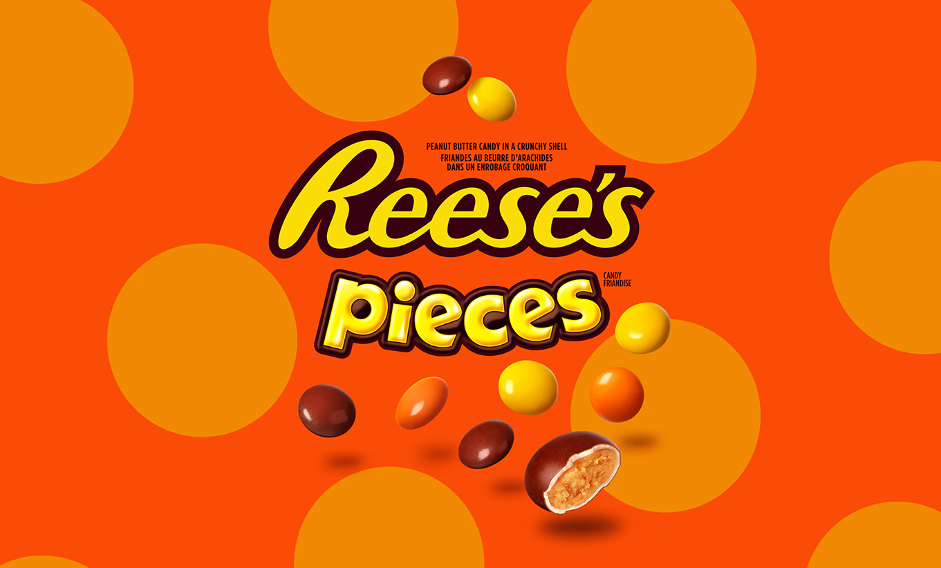
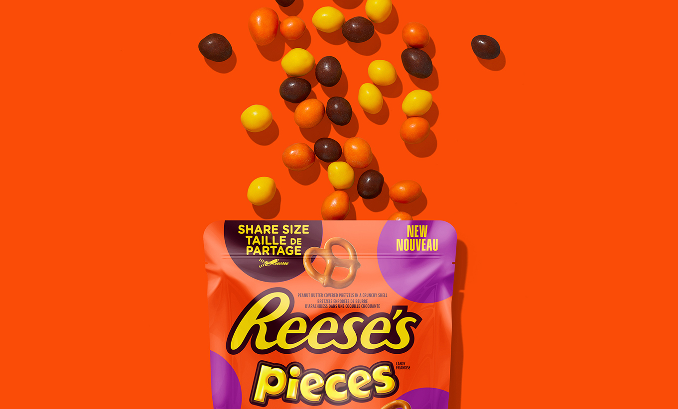
By embracing Reese’s orange background, we used the brand’s key equity element to unify the Reese’s Pieces with the balance of the Reese’s portfolio. We created a strong circle graphic, adding energy, modernity and spotlighting the product visuals. The new images were super-sized to ignite craving and allow the product to come to life. The bright and impactful colours provide clear variety delivery and contrast nicely with the orange background for strong shelf presence. We established a dynamic Reese’s Pieces architecture that helps to create a solid foundation for future innovations and brings to life Reese’s iconic personality.
The Results
Initial launch has proven successful with the introduction of additional facings at shelf.
