The Challenge
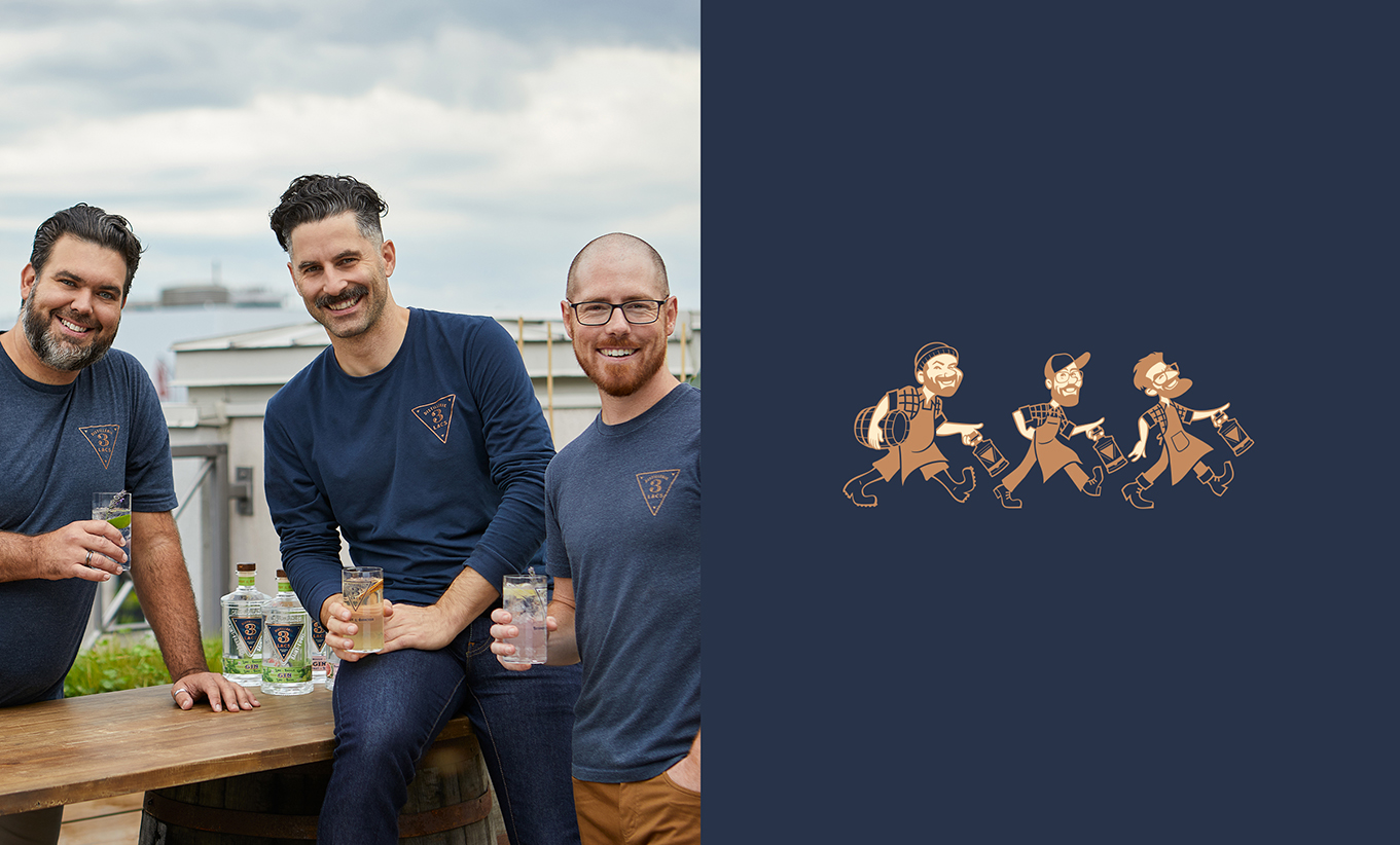
Distillerie 3 Lacs was a new distillery formed by 3 childhood friends who wanted to reinvent classic spirits with a daring touch of botanical freshness. Launching a new brand of gin in a highly competitive landscape is a challenge by itself, the gin category of Quebec homegrown products having grown rapidly with local gin brands going from 15 to 55 in just 2 years. The design ecosystem would have to perform in an extremely busy store environment as well as online, knowing that the launch would not benefit from other meaningful marketing activities.
The solution
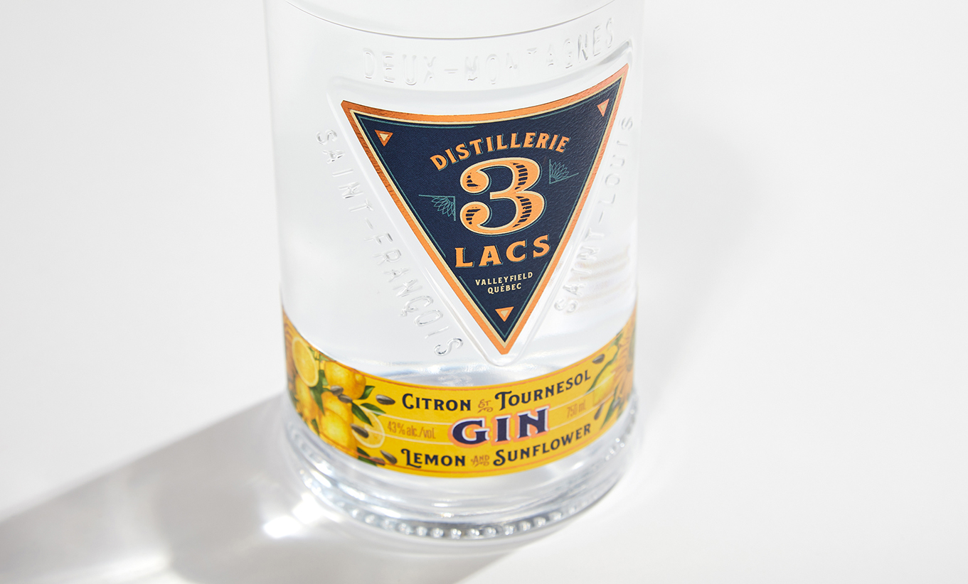
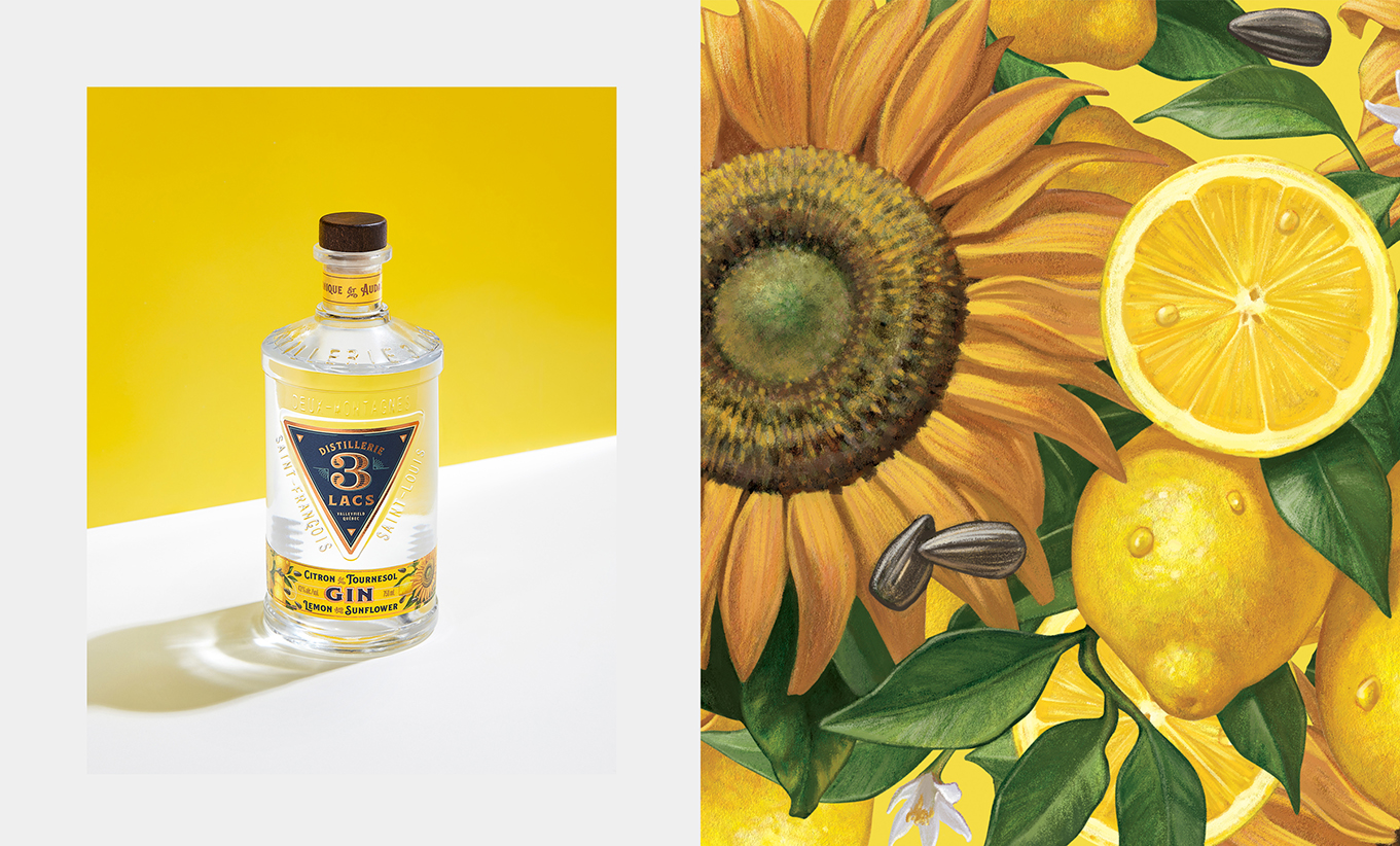
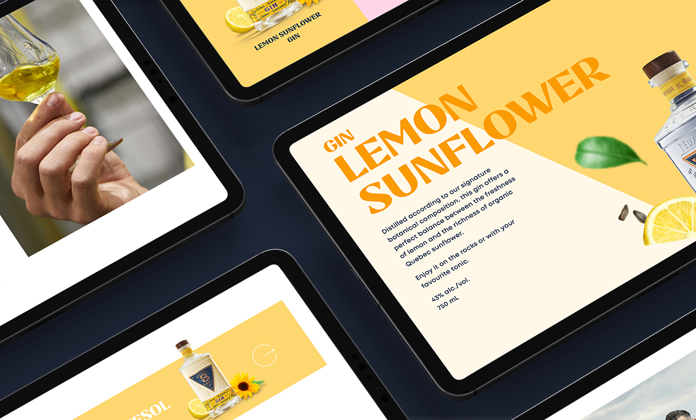
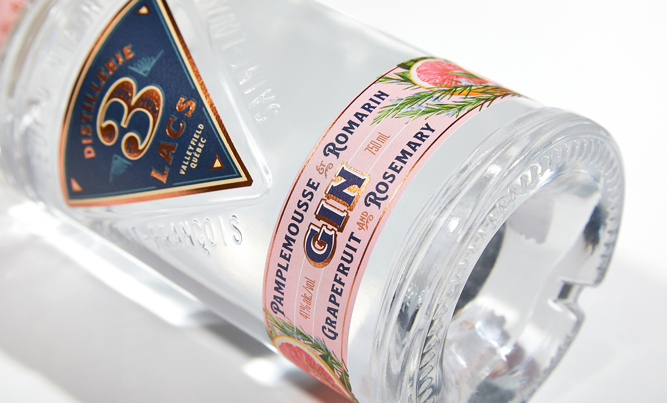
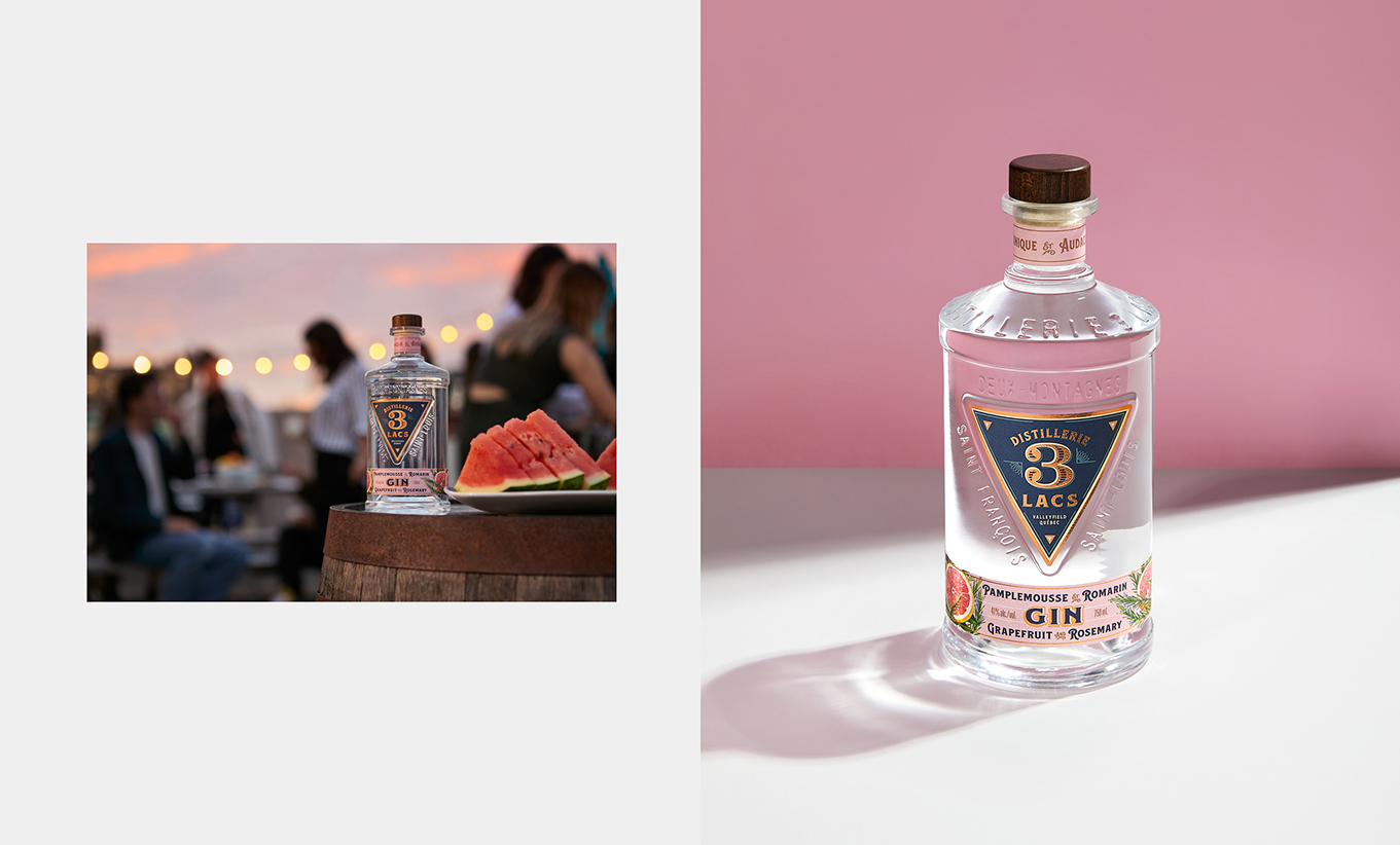
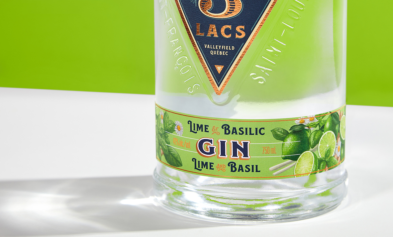
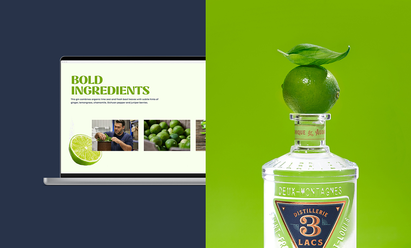
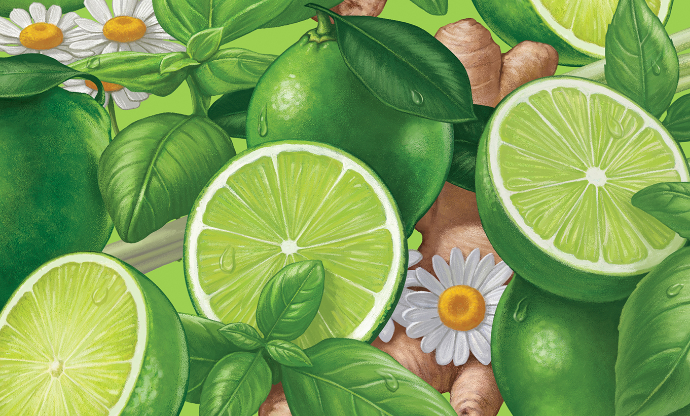
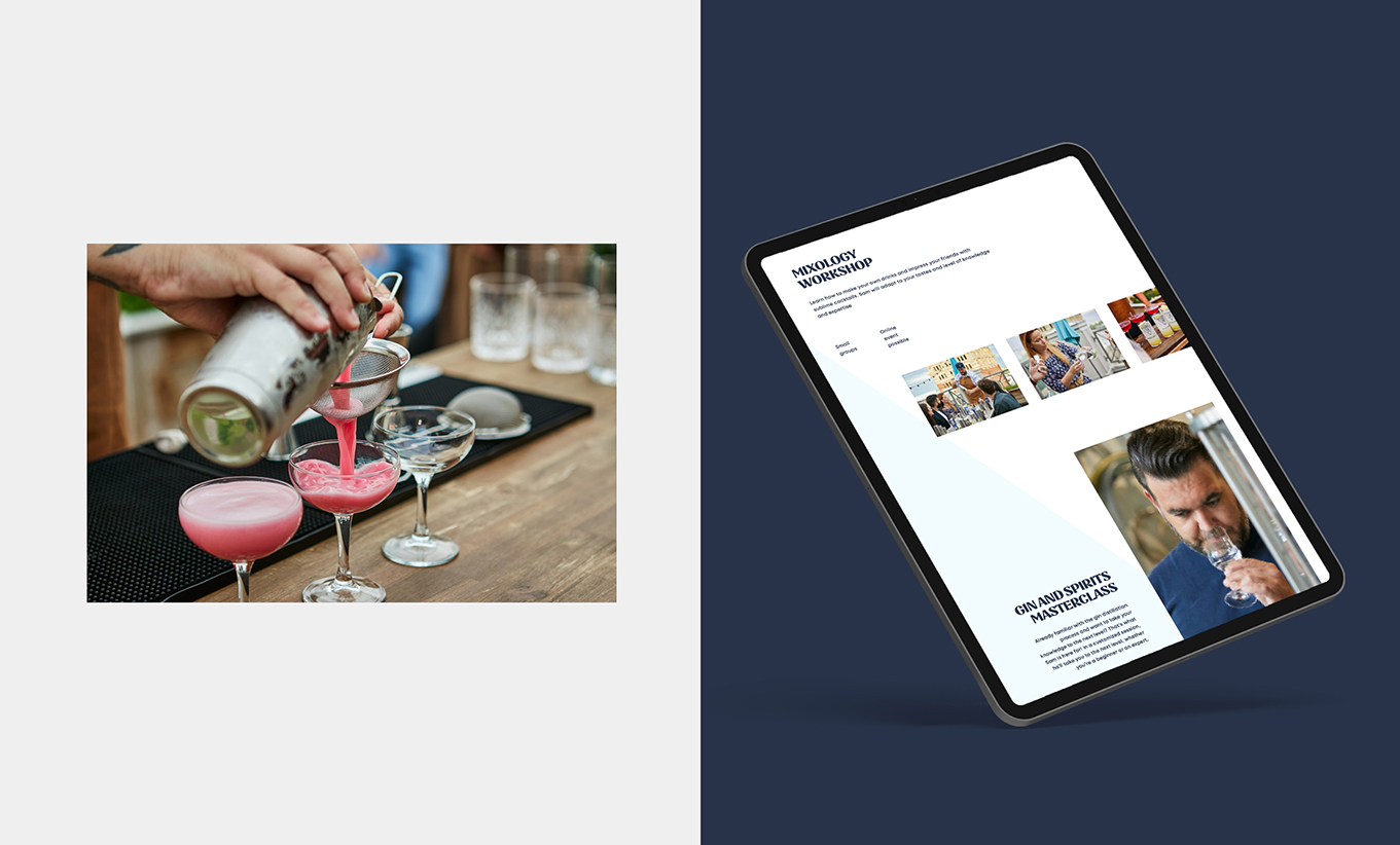
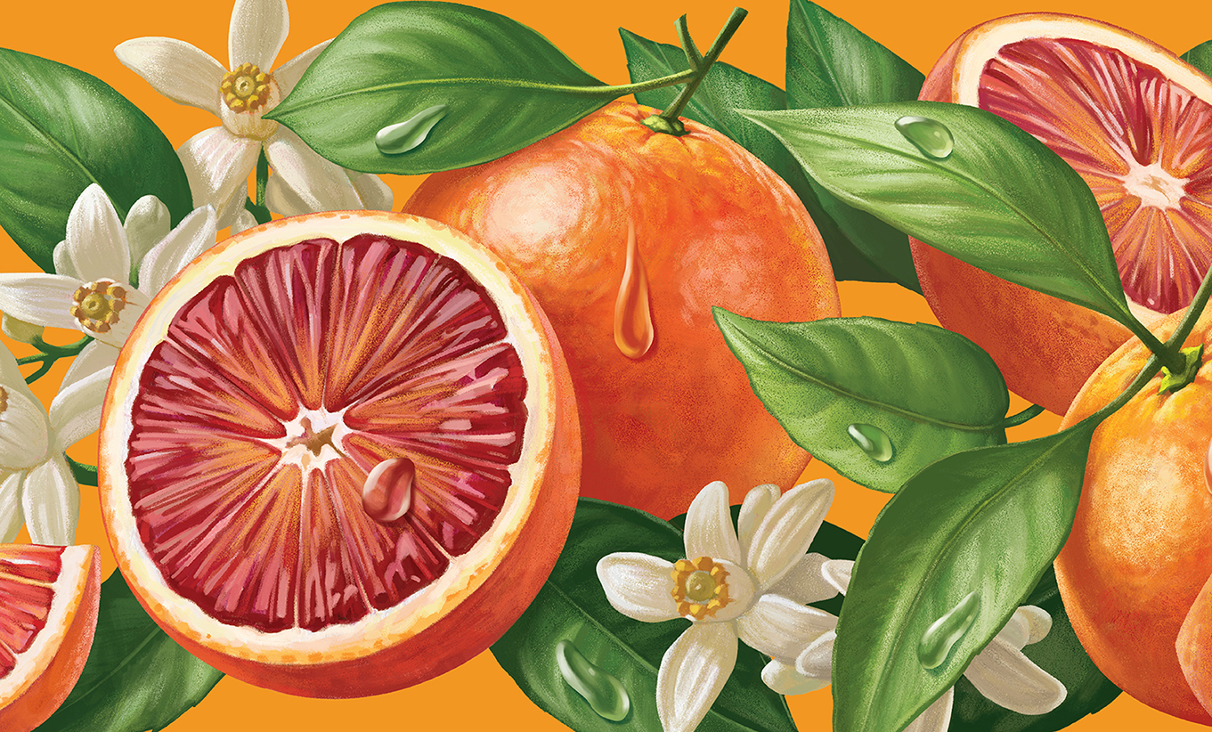
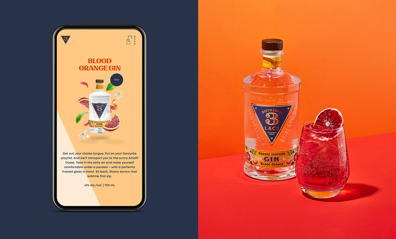
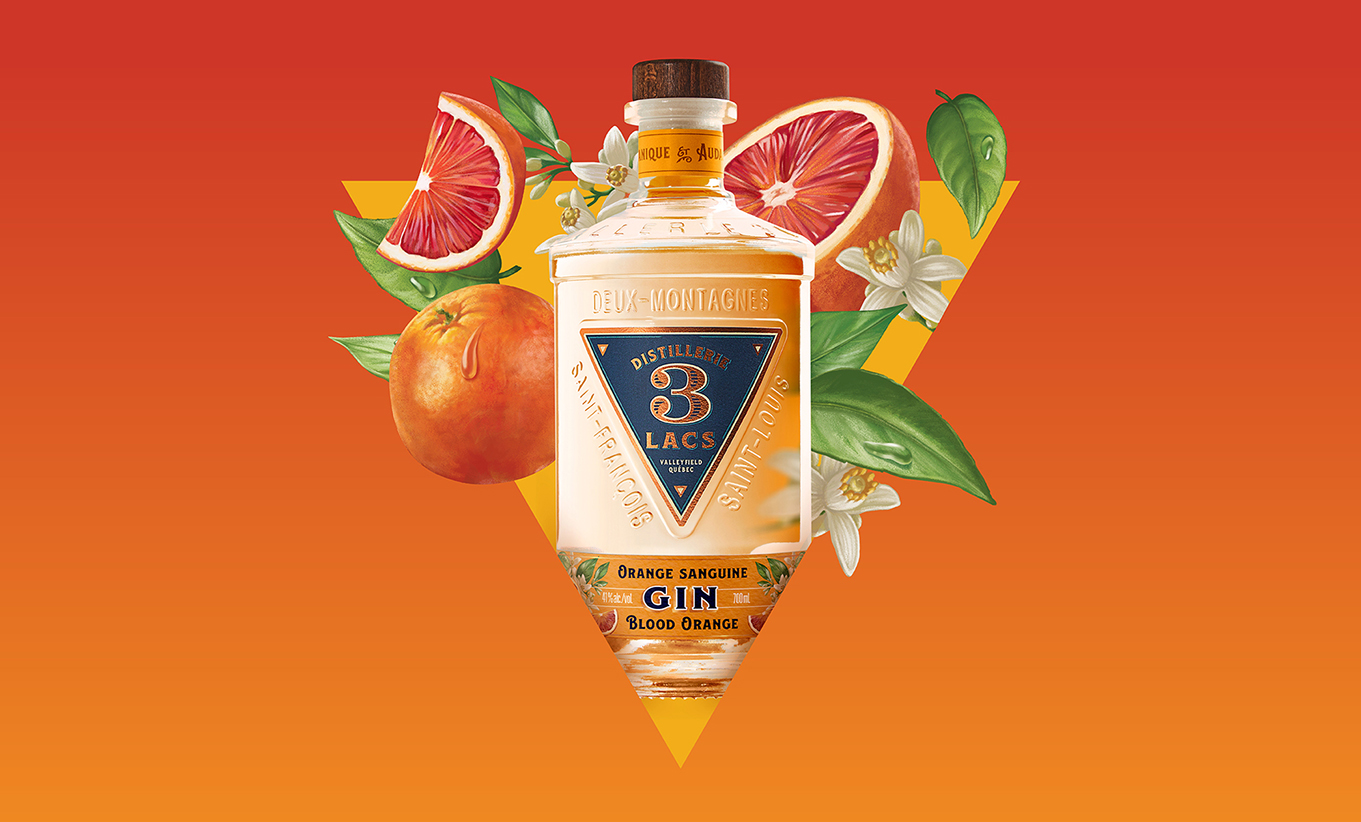
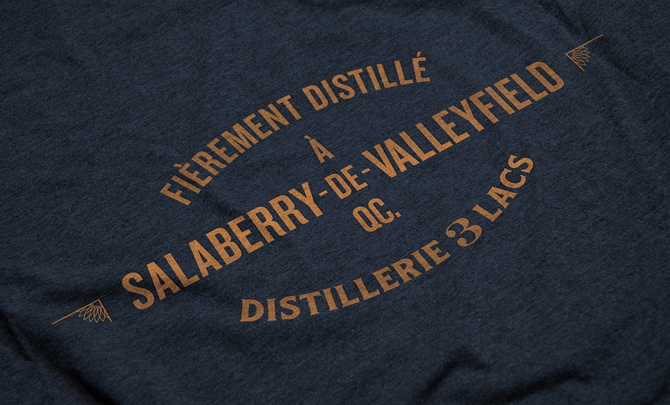
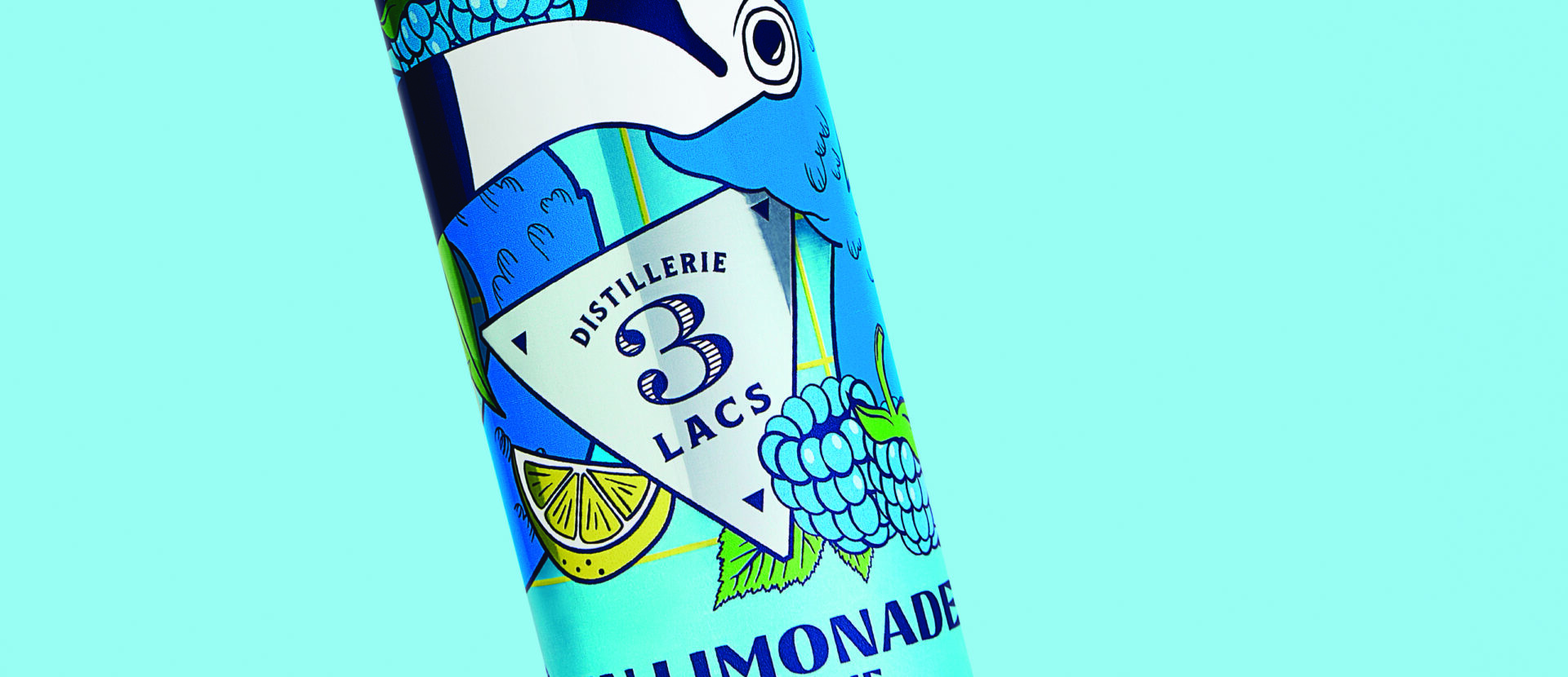
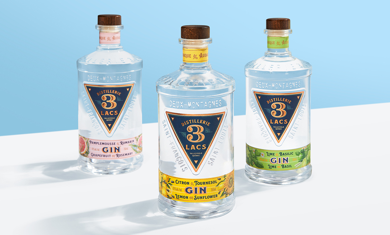
Beginning with brand strategy, we positioned the brand as ‘authentically surprising’ – targeting a consumer that is in discovery mode, curious and always looking to try new flavours. The next mandate was to design the bottle itself, developing a custom-mold shape that stands out and reflects a local artisan style to connect with young adults who support local producers. The shield-like logo and brand identity that proudly travels from one bottle to another in premium and sophisticated navy blue and gold colours gives a nod to the 3 friends and founders as well as the 3 lakes of Valleyfield where they originated. We opted for fonts and graphics that portrayed an apothecary tone, hitting home the daring use of botanicals in these gins. We then extended the brand’s new identity and look and feel to its website with clean, contemporary, fresh, and sophisticated imagery.
The results
In only a few weeks, the client had already surpassed its launch sales objectives for the original Pink Grapefruit and Rosemary gin launch, eventually becoming the #3 best seller in the category in less than 16 weeks – an outstanding performance driven purely by design. 3 years after launching, the brand has gained so much momentum it has now expanded into new flavours and categories, making a splash each and every time.
